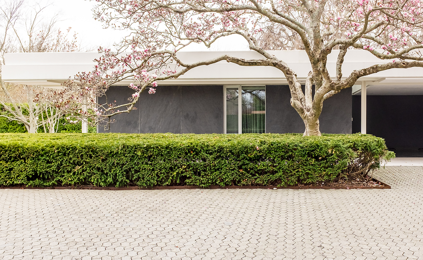
An architecture snob’s dream, Columbus, Indiana — a town of just 46,000 people, give or take — is a living museum filled with works by architectural titans. The built landscape of this tiny southern Indiana town is littered with midcentury modern works by I.M. Pei, Harry Weese, Deborah Berke, and Eliel and Eero Saarinen. It was the latter Saarinen who crafted what would become a perfect melding of three design disciplines: his architecture with Dan Kiley’s landscape architecture and Alexander Girard’s interior design. Completed in 1957, the final product was a balance of light and magic known as the Miller House and Garden. Today, more than 60 years after its completion, the midcentury modern house is a shared jewel in the crowns of the three design masters.
Origin stories
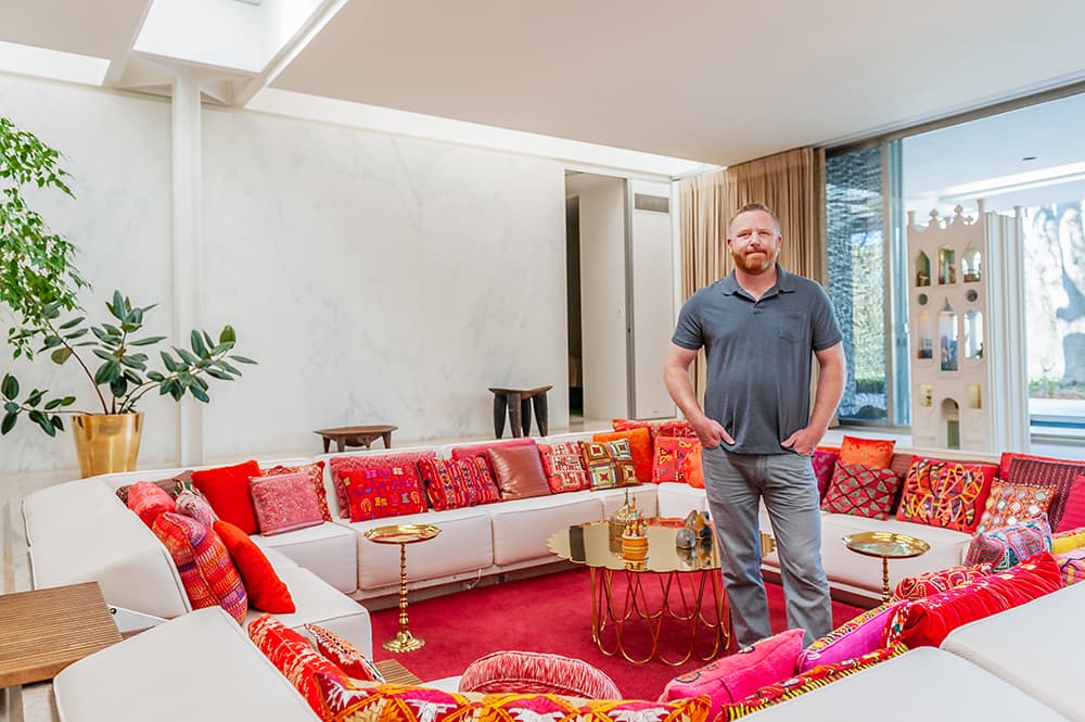
Ben Wever, site manager of the Miller House and Garden, stands inside the iconic conversation pit. | Photo by Adam Reynolds
The Miller House began with industrialist and civil rights leader J. Irwin Miller, who was known by Columbus residents simply as Mr. Miller. In 1953, Miller, then chairman of Cummins Engine Co., commissioned Michigan-based architect Eero Saarinen to conceptualize and design the home, which would be used not only as a year-round residence for Miller and his wife, Xenia, but also as a place for the company leader to entertain the scions of industry — a space that didn’t exist in Columbus at the time. Miller had previously commissioned Eero Saarinen’s father, Eliel, to design the First Christian Church in downtown Columbus. Finished in 1942, this was the first church built in the U.S. in the contemporary style. Columbus then became the place for other renowned architects to play. Eero Saarinen had first designed for the Millers a summer house in the Muskoka region of Ontario, Canada. Next, the Millers wanted a year-round home, a residence that was for family life but grand enough to impress an industry leader.
“People don’t see the house from the road,” says Ben Wever, site manager for the Miller House and Garden. “I’ve had people ask, ‘Is it three stories, four stories? How many garages are on it? Well, it’s a one-story, flat-roof house, and I think that’s really neat. Mr. Miller could have made this house as big as he wanted, but he … wanted to have certain design aspects to it. Not as something to show off.”
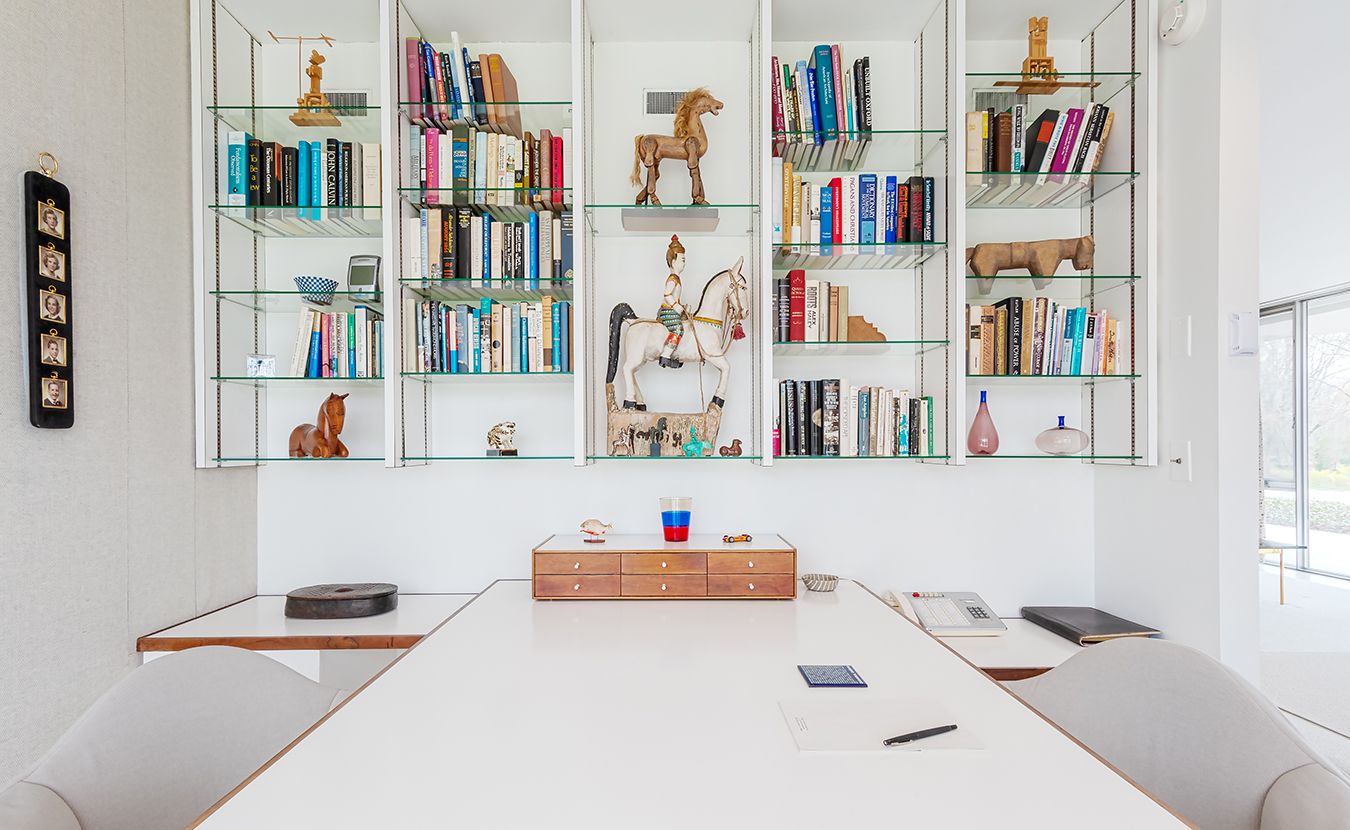
Miller’s master bedroom office features a display of objects from around the world. The Millers’ children can been seen in the photographs on the far left. | Photo by Adam Reynolds
Designed by Saarinen and architect Kevin Roche and completed in 1957, the approximately 6,840-square-foot, single-family residence became the home to the Millers and their five children. In addition to being a family man and chairman of Cummins, Miller was a civil rights leader, being a strong advocate for the Civil Rights Act of 1964 and working with Martin Luther King Jr. to organize the March on Washington.

Shirley Bozell, center, leads a tour group at the Miller House. | Photo by Adam Reynolds
In May 2000, the Miller House took its rightful place on the National Register of Historic Places and was named a National Historic Landmark.
Miller died in 2004; Xenia followed in 2008, leaving the house unoccupied. In 2009, the Millers’ children called a meeting with community stakeholders, preservation experts, and architects to tackle the question of managing the property. At the end of the two-day meeting, the family donated the house to the Indianapolis Museum of Art (recently rebranded under the name Newfields).
Lynn Lucas, the retired executive director of the Columbus Area Visitors Center, remembers when the house opened for tours in 2011. Eyes turned toward the tiny Midwestern town for the first time in decades. “It was a reason to come to Columbus for the first time,” Lucas says. “For [others], even though they had seen the architecture, this was a reason to come back.”
The tours
To tour the Miller House, one must first buy a ticket from the Columbus Area Visitors Center, watch an introductory video, and then board a 13-passenger van, which travels through Columbus’s main drag, Washington Street. Upon arrival at the Miller House, the horse chestnut and crabapple trees that greet you are a part of the grand vision; after all, landscape architect Kiley wanted the 14.5 acres of surrounding land to be an extension of the home.
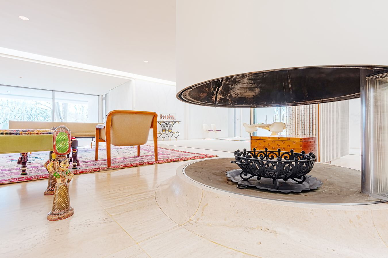
The Millers’ cylindrical fireplace is a centerpiece in the open floor plan of the house. | Photo by Adam Reynolds
Wever has viewed the home from every possible angle and thinks Kiley was successful in that mission. “Every room of the house, intentionally, has a separate view of the landscape,” he says of Saarinen’s complementary home design.
Wever remembers when the house was a home; his grandmother worked for one of the Millers’ companies, Irwin Management, and he visited the house with his grandmother. He remembers eating Oreos by the pool; he also remembers entering Mrs. Miller’s office, with permission only, to visit with his grandmother and the Miller matriarch. Wever began working for the family in 1996, as seasonal staff, eventually becoming Mr. Miller’s personal assistant. Today, Wever, who lives in a separate house on the property, watches over the facility, leads VIP tours, manages security, coordinates volunteers, and trains the house’s docents. A detail-oriented man, he plucks every errant plant growing from the cracks in the paving stones around the property. The Miller House, an environment that’s heavy on the details, is the perfect setting for Wever, and he cherishes every square foot.
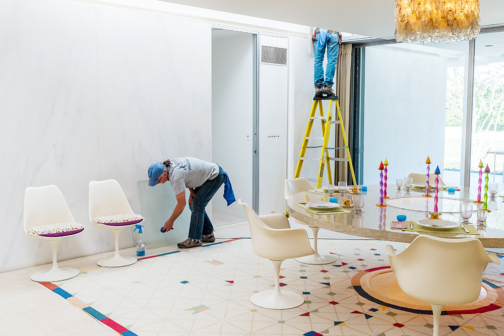
Bill Whaley and Ray Palmer clean the skylights in the dining room. | Photo by Adam Reynolds
“I got to be around Mr. Miller every day of the week,” he says. “I was around Mr. and Mrs. Miller quite a bit. It was always amazing to me how generous and humble [he was] and just one of the nicest guys that I’d ever met. If I did something for him, he’d say, ‘Thank you, sir.’ and I’m 22, 23 years old and this is one of the greatest men around and he treated me with a lot of respect, and it was just a great experience.”
“I try to maintain what I saw with the Millers,” Wever says. “I don’t really view myself as anything more than a caretaker for an amazing place. I think the design is where the credit is due.”
The house
The Miller House is grand but it does not look as massive as its square footage would suggest. The one-story, flat-roofed house is low-slung and hushed. It’s not ostentatious. “It’s still quite a large house,” Wever says. “But Mr. Miller could have had something much larger than that, too. He wanted to make it a close-knit family home.”
Step inside and you feel as though you’ve entered sacred ground; the effect, as Lucas says, is “incredibly simple but so profound.”
Architects Saarinen and Roche’s open floor plan, marble walls, and spectacular cylindrical fireplace evoke primal memories as light trickles in from the skylights, which are set in a grid pattern that is supported by a set of 16 cruciform steel columns. Visitors are relegated to the floor runners trailing through the 80 percent of the home that’s on the tour. You enter in the front and follow the guide into the living room area, to the library, down the hallway to the children’s bedrooms, then to a bathroom and a master bath, the master bedroom, master dining area, through the blue-tiled kitchen — a working kitchen but no less beautiful than any other part of the house — winding back to the front of the house, with longer stops to admire the crisp landscape and Girard’s design flourishes, including a rug that bears stylized icons of the things the family held dear: their family, their church, and Cummins.

The Millers’ blue-tiled kitchen (left) and a sitting room that was always referred to as the “TV room.” | Photos by Adam Reynolds
With its white marble walls, the house could have looked like a mausoleum, but interior designer Girard, working closely with Xenia, infused the home with color. “Mr. Miller gets so much press, but the home is the story of Xenia Miller as well,” Lucas says. “It’s not just a white box. It’s a home full of color and life.” The living room pops with red, which glows from the bottom of the grand piano and from the cushioned conversation pit. The girls’ bedroom windows are hung with Girard’s quatrefoil-print curtains, and the built-in circular dining room table, where Xenia welcomed guests, continues to impress long after the dinner parties have ended. Objects from far-flung corners of the globe reflect the design’s deliberate nature.
“People talk about a juxtaposition of all of these objects, but I’m positive that if you were talking to the man, if he were still alive, that Girard had a very specific reason that he did all of this,” Wever says. “It doesn’t look gaudy. Anybody can make a beautiful streamlined piece and do it in white or black or grays or whatever. It would be easy to make a minimalist space look pretty, but there’s nothing minimal about this design, which is almost the antithesis of modernism.”

